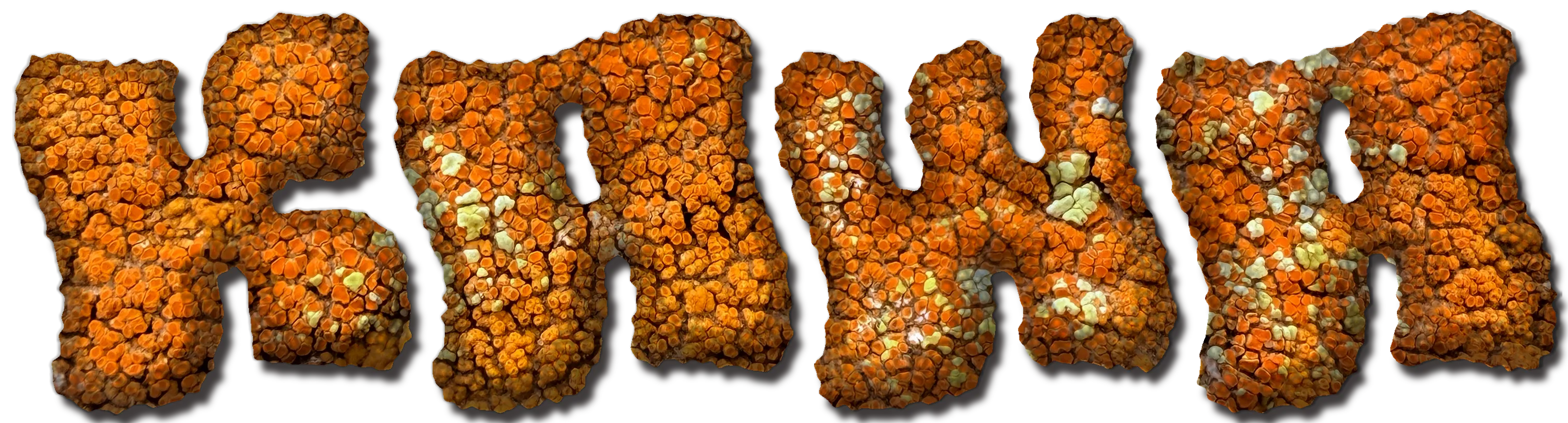
Kawa Brand Creation
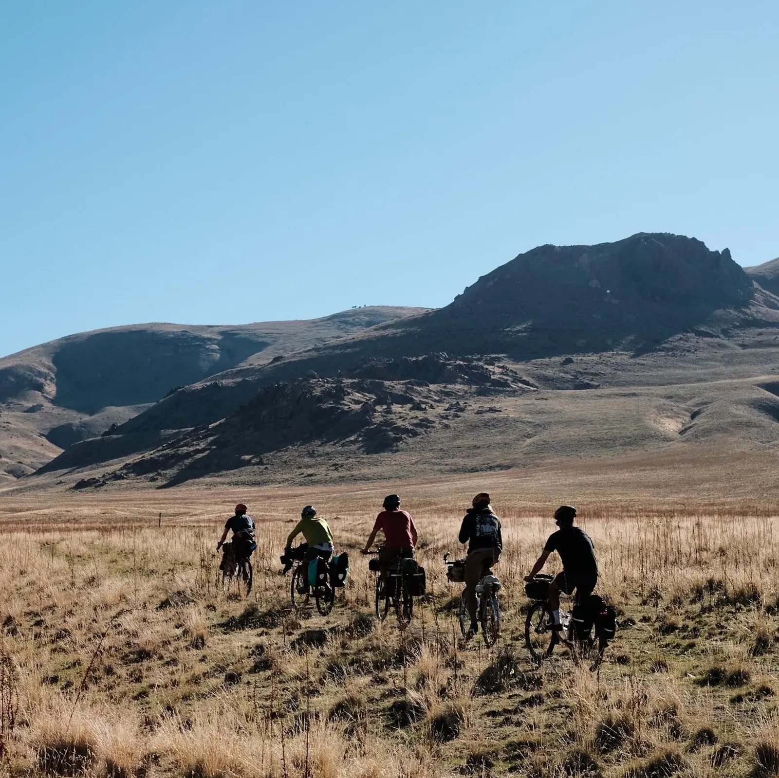
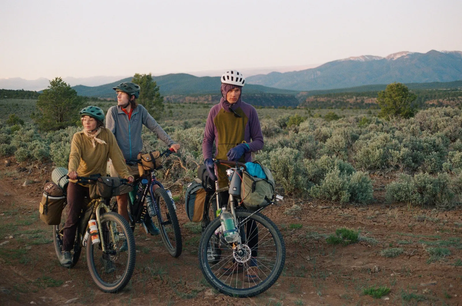
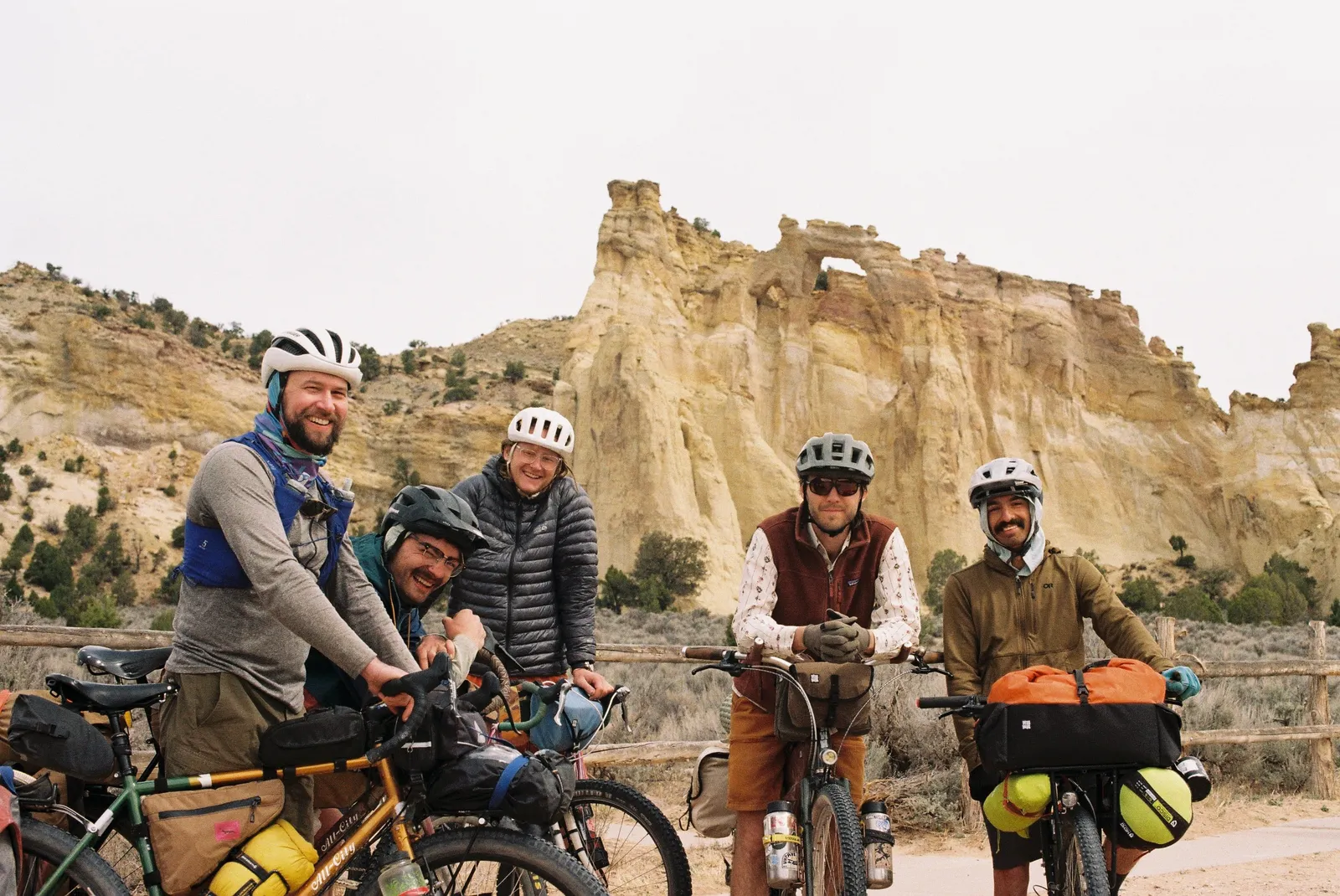
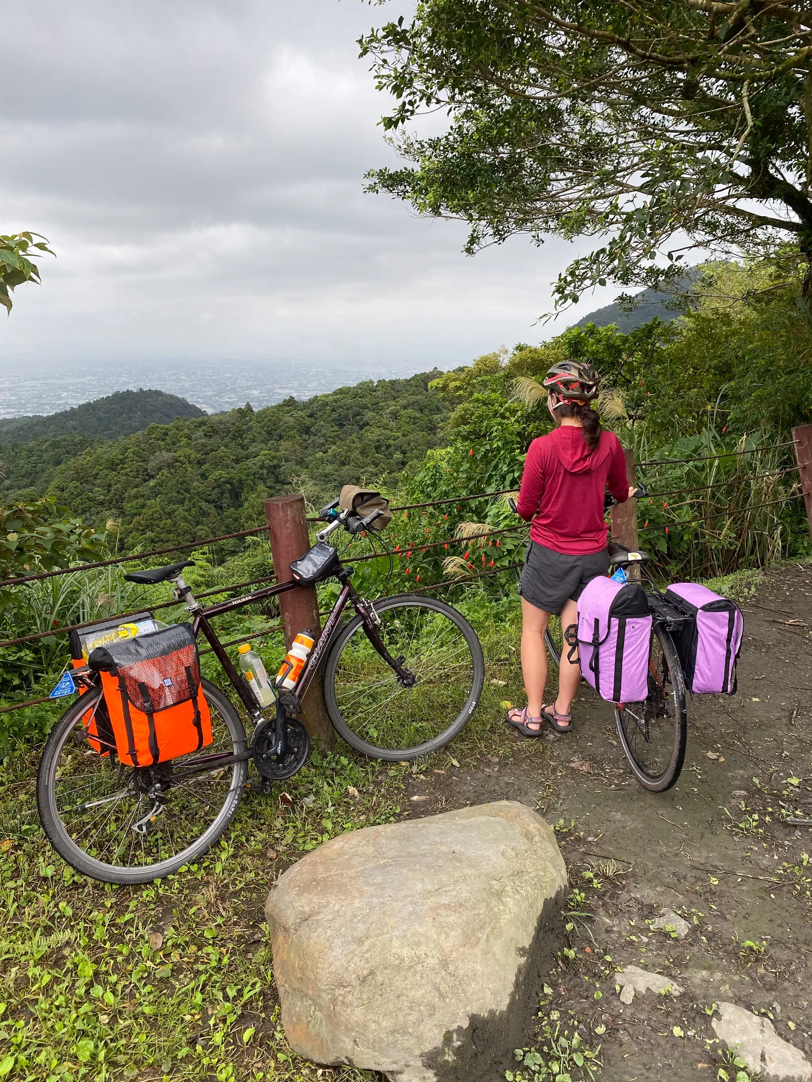
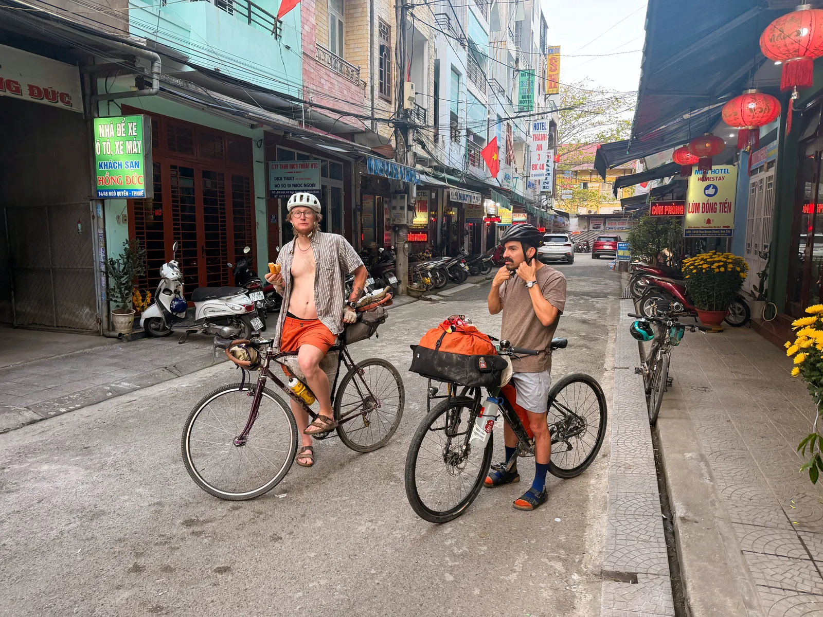
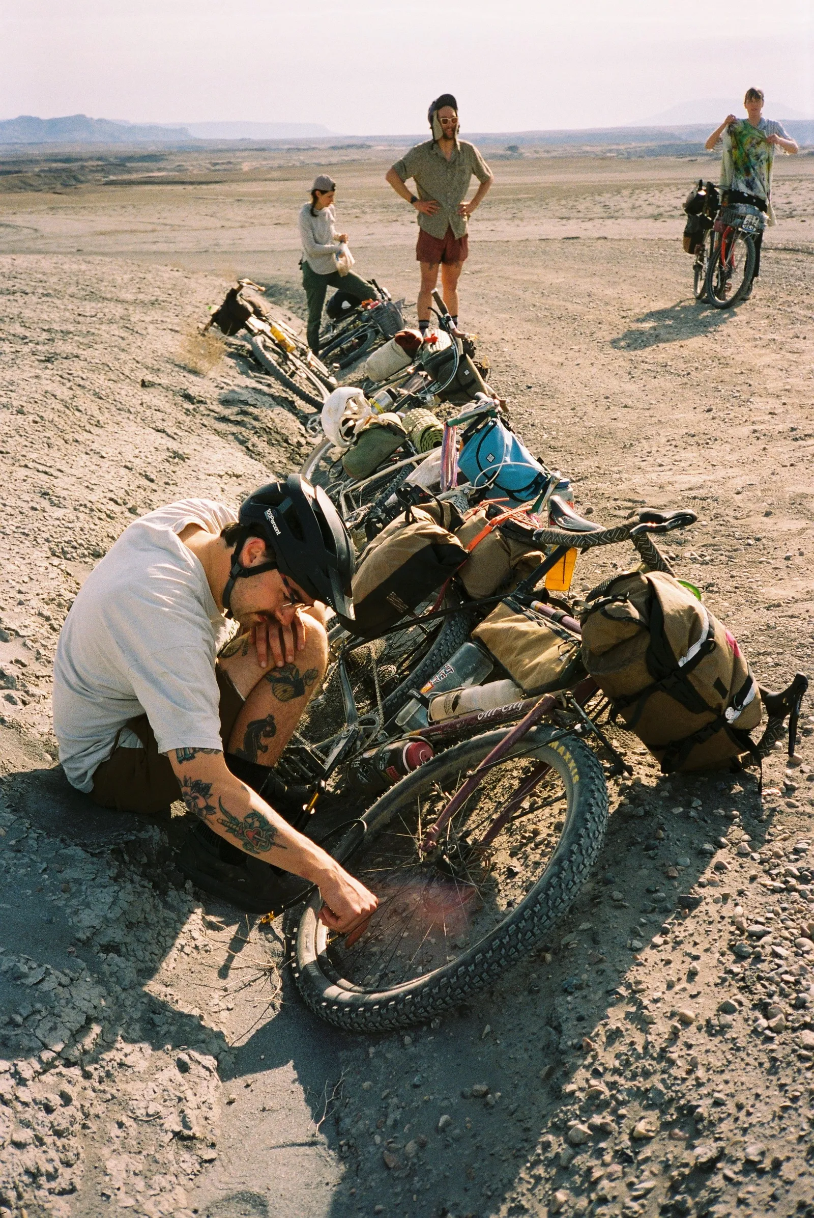
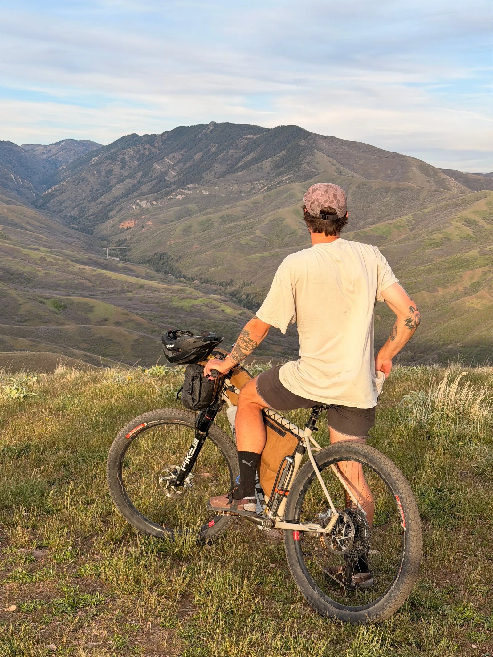
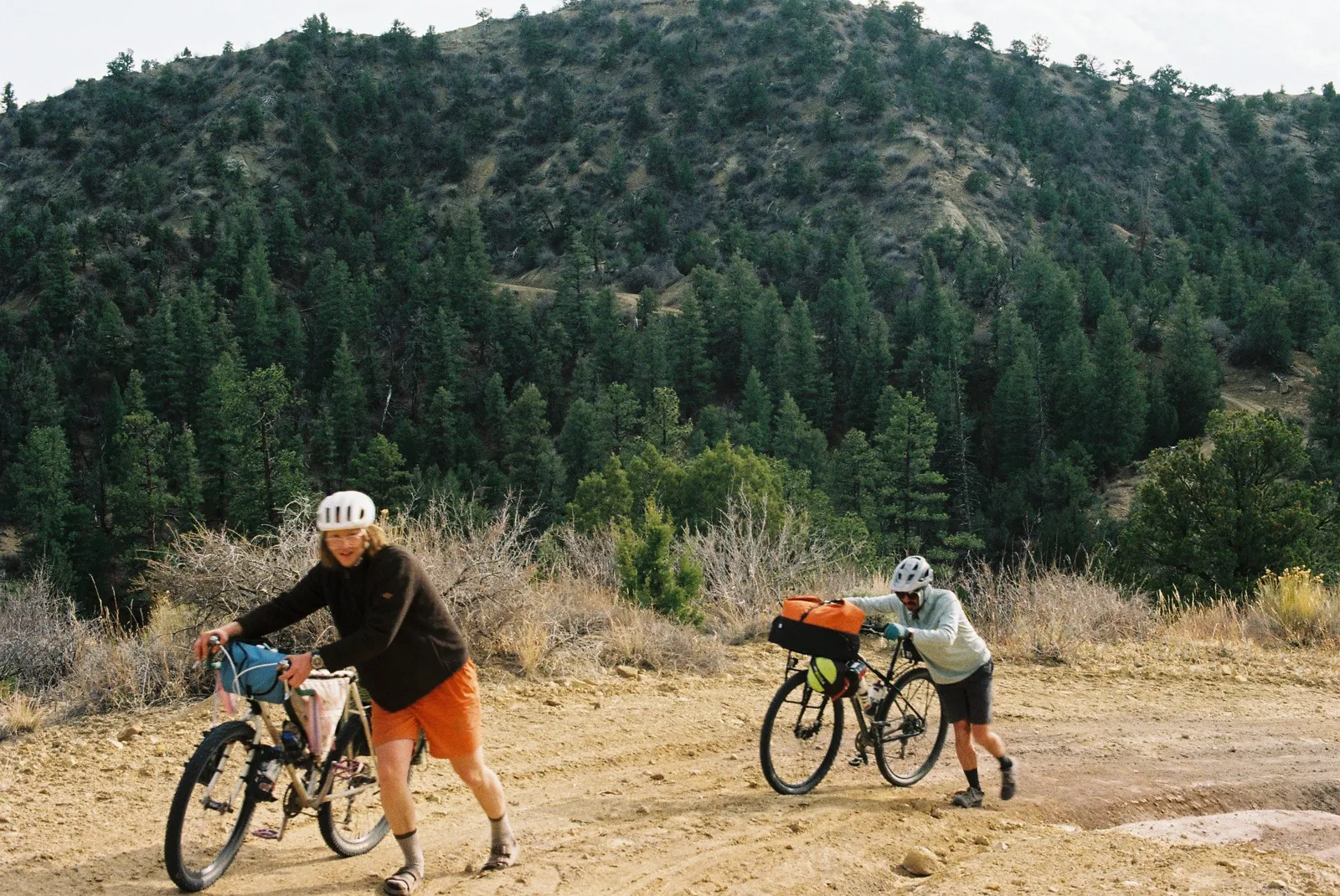
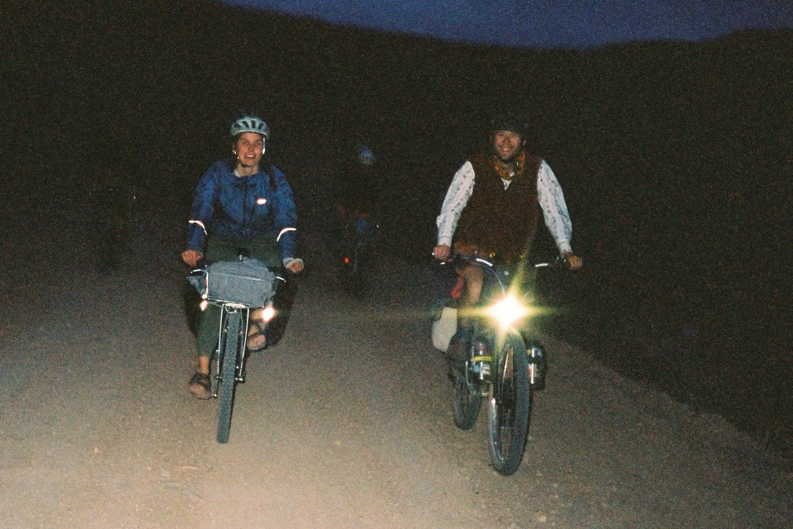
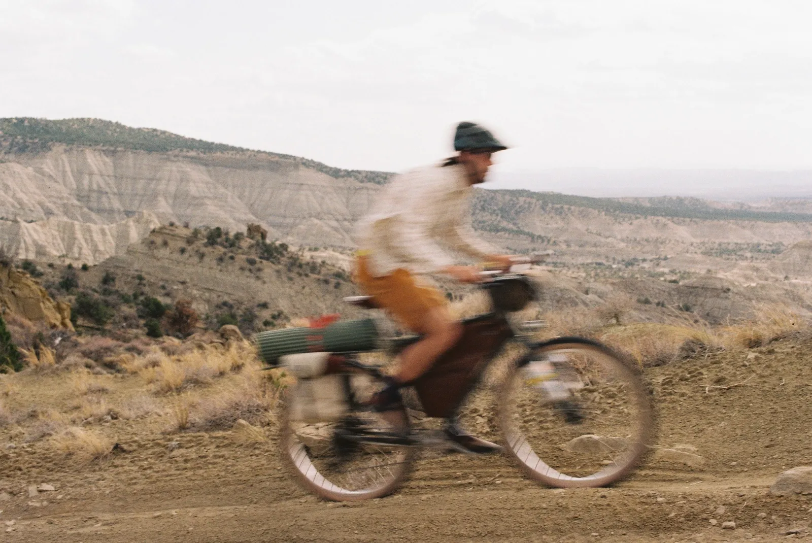
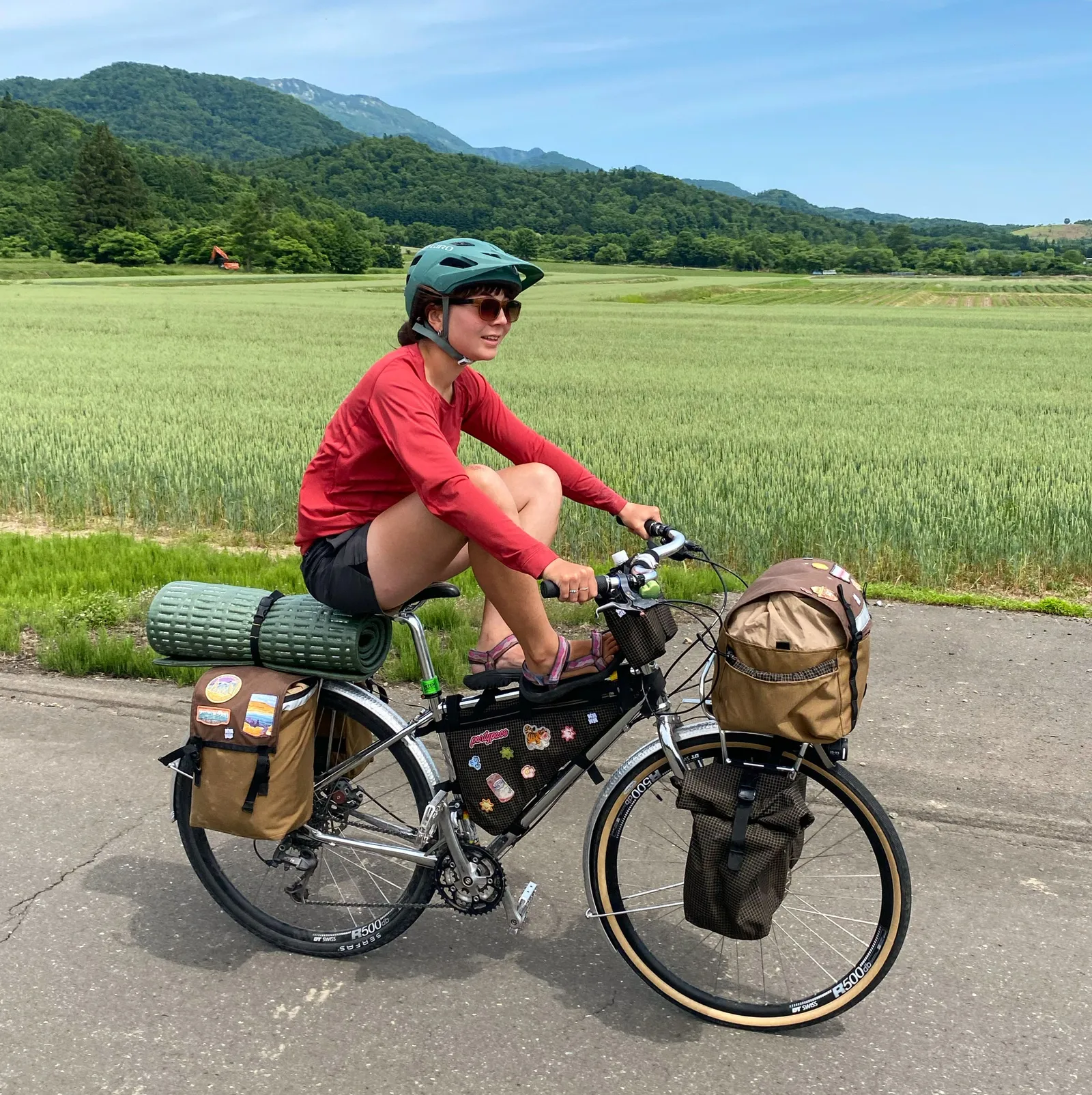
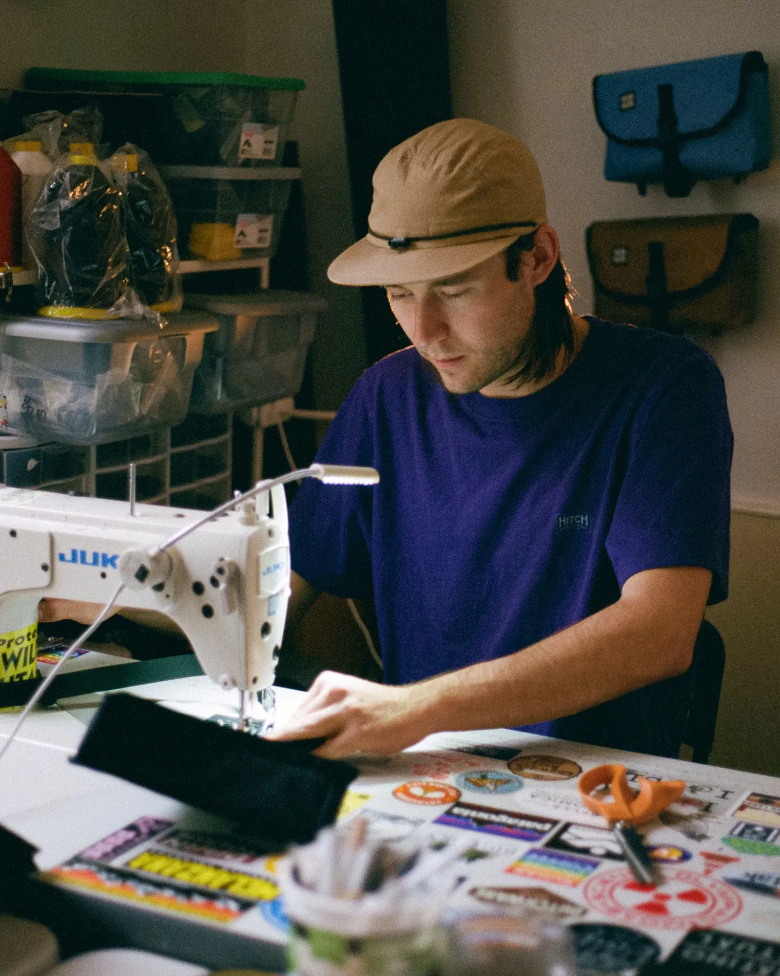
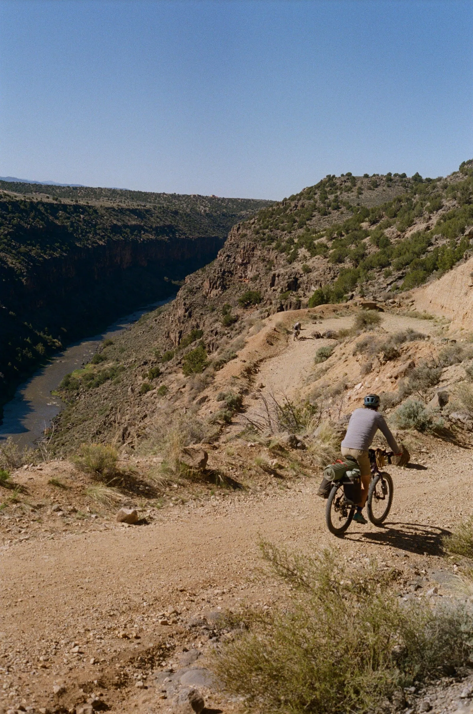
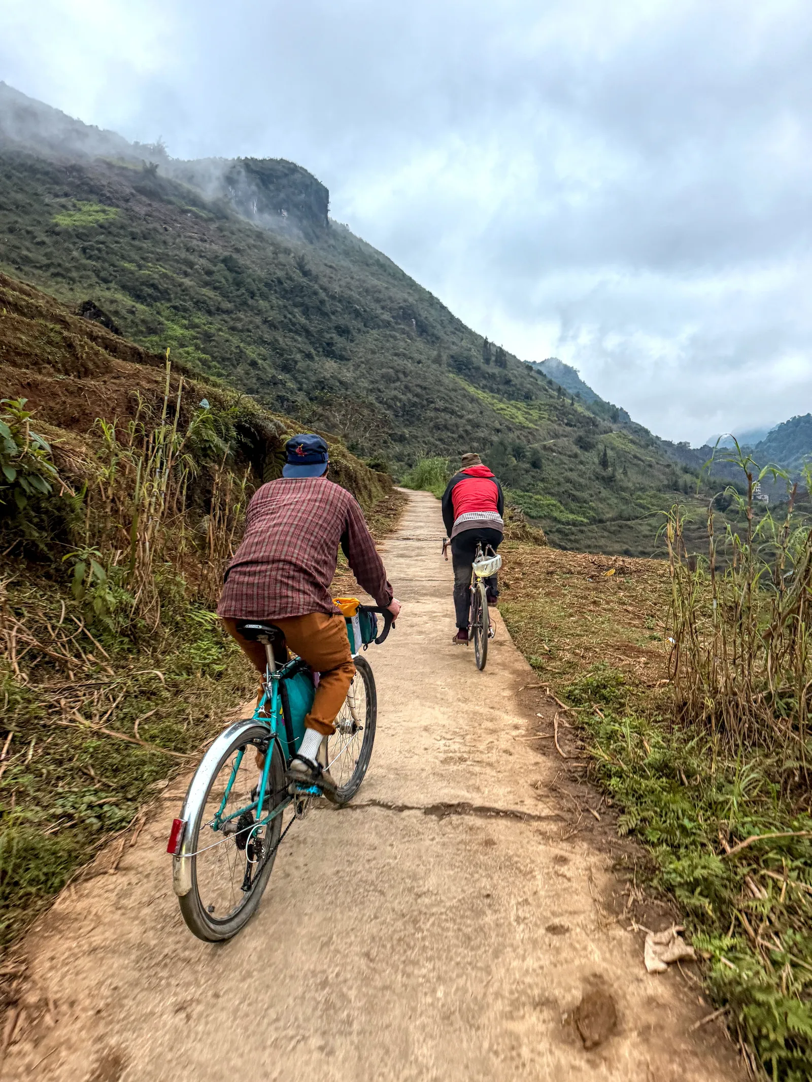
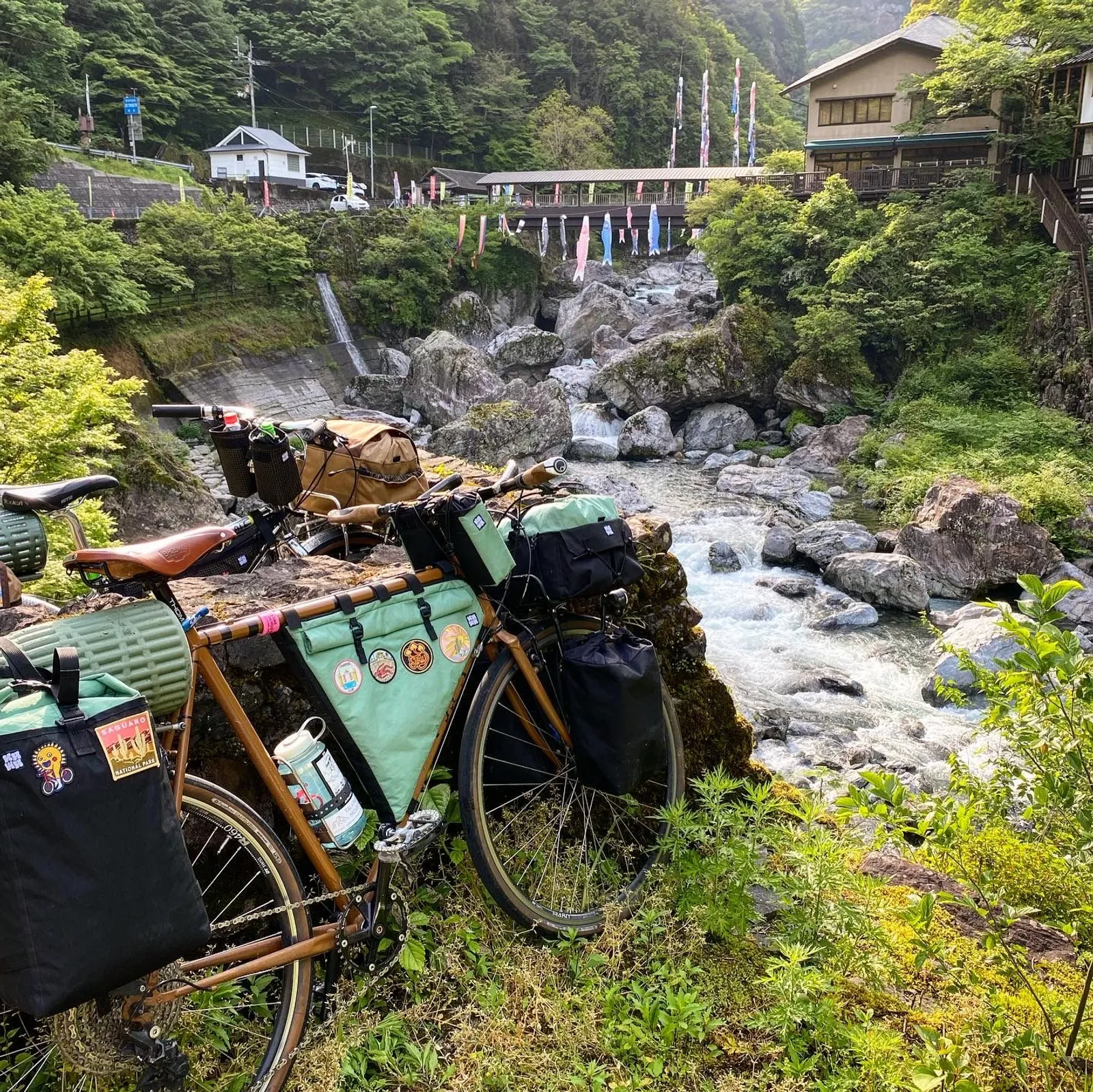
Kawa in Japanese means River, which is my name. I was first inspired to go with this name because of a trip to Japan that I went on when starting the company, where me and a group of friends spent about three months biking through the country using bags I had sewn myself. I created Kawa as a way to show my personal product designs, as well as how I used and tested my products. Kawa’s identity is a reflection of my own, and I created its aesthetics and design language to match that. The brand language is unserious in tone, but there is still a reason and purpose behind every decision I have made with creating it.
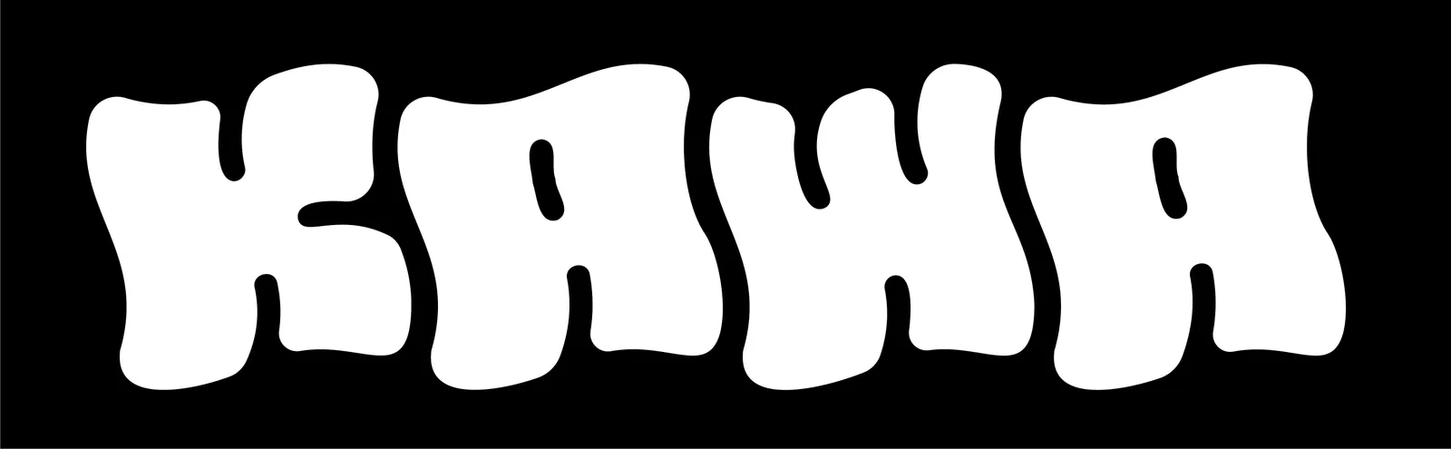
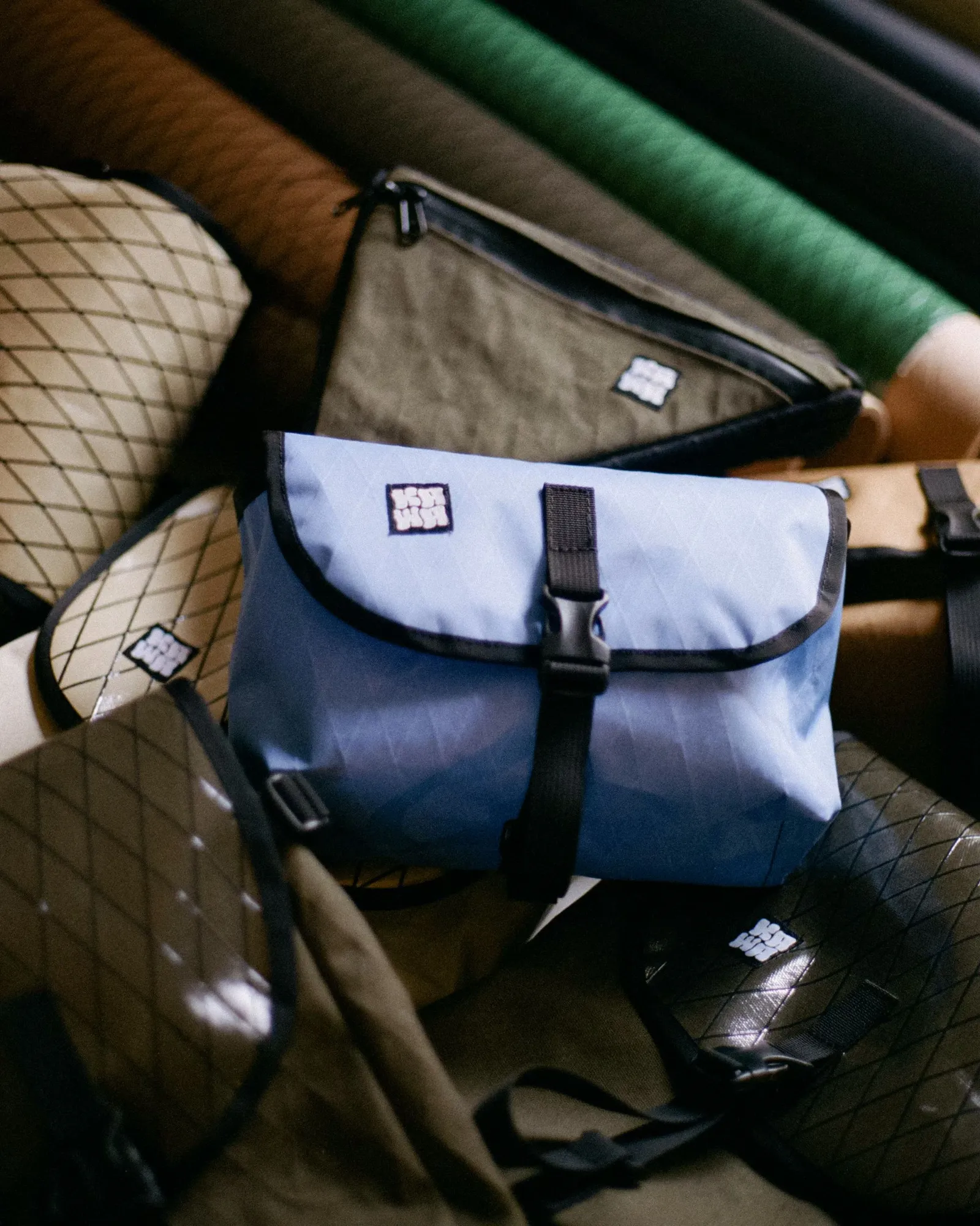
The logo for Kawa followed this same thought process of being visually fun and playful but still having a set structure and meaning. The custom font I made for the logo is a wavy bubbly text made to resemble the flowing water of a river, both a callback to my name, and the natural inspired theme of the brand. The big round font forms are also designed to give a playful fun vibe. Underlying the design of the text is a custom Circular grid I designed that connects all font geometries, making a uniform identity for every letter.
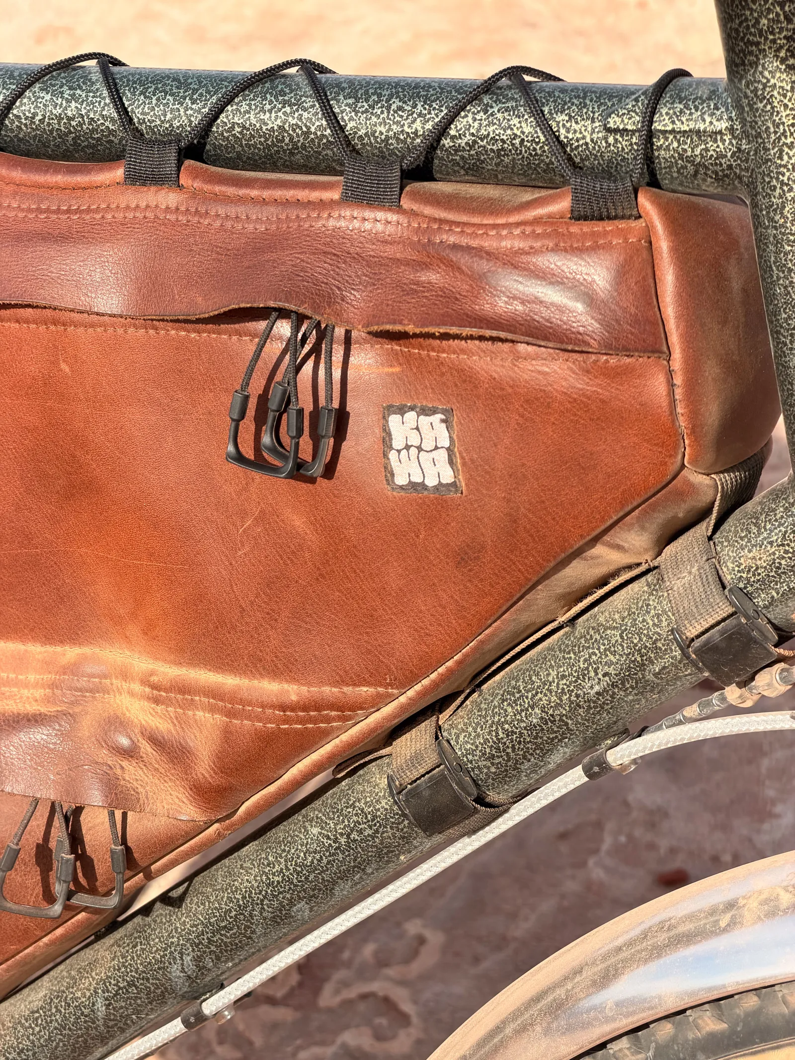
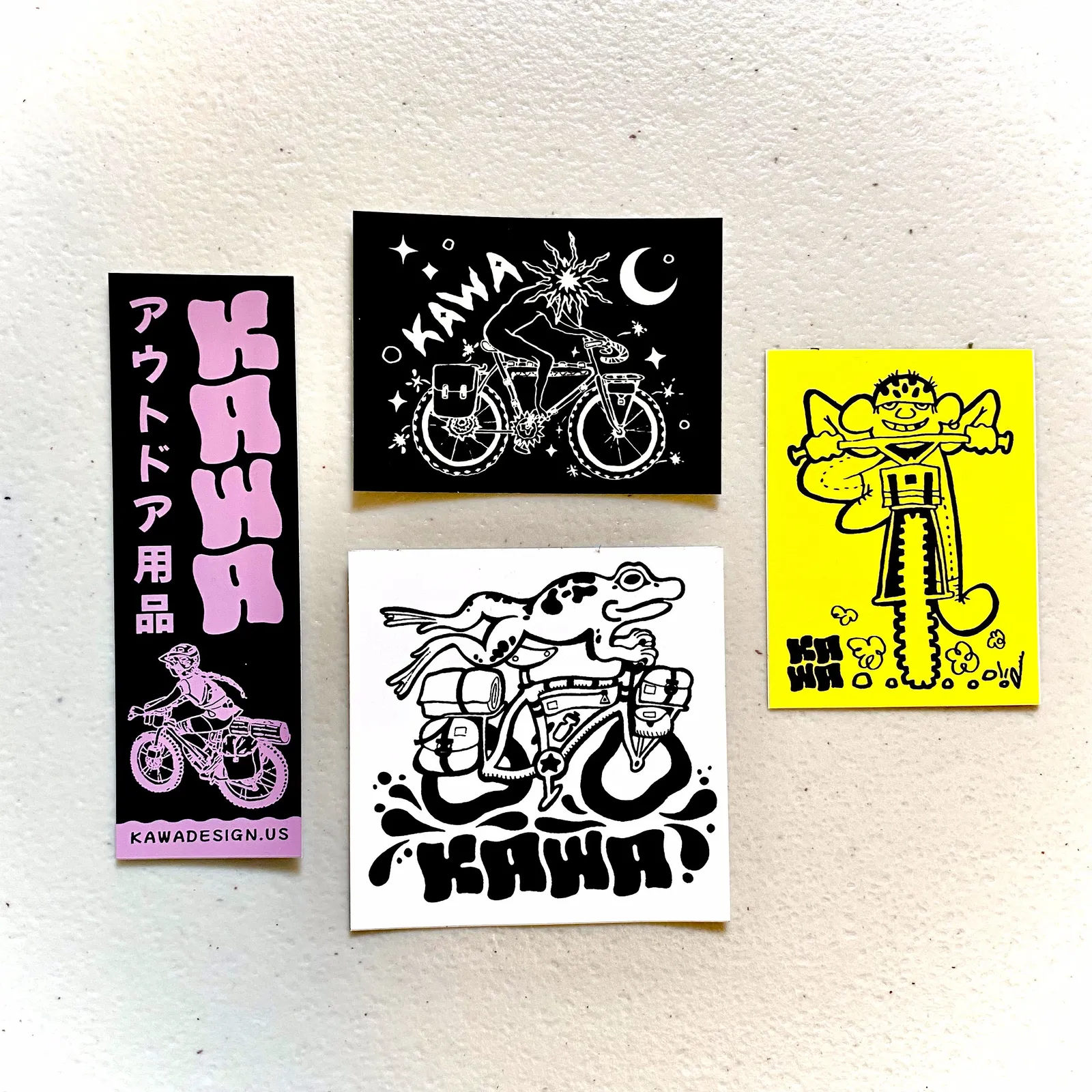
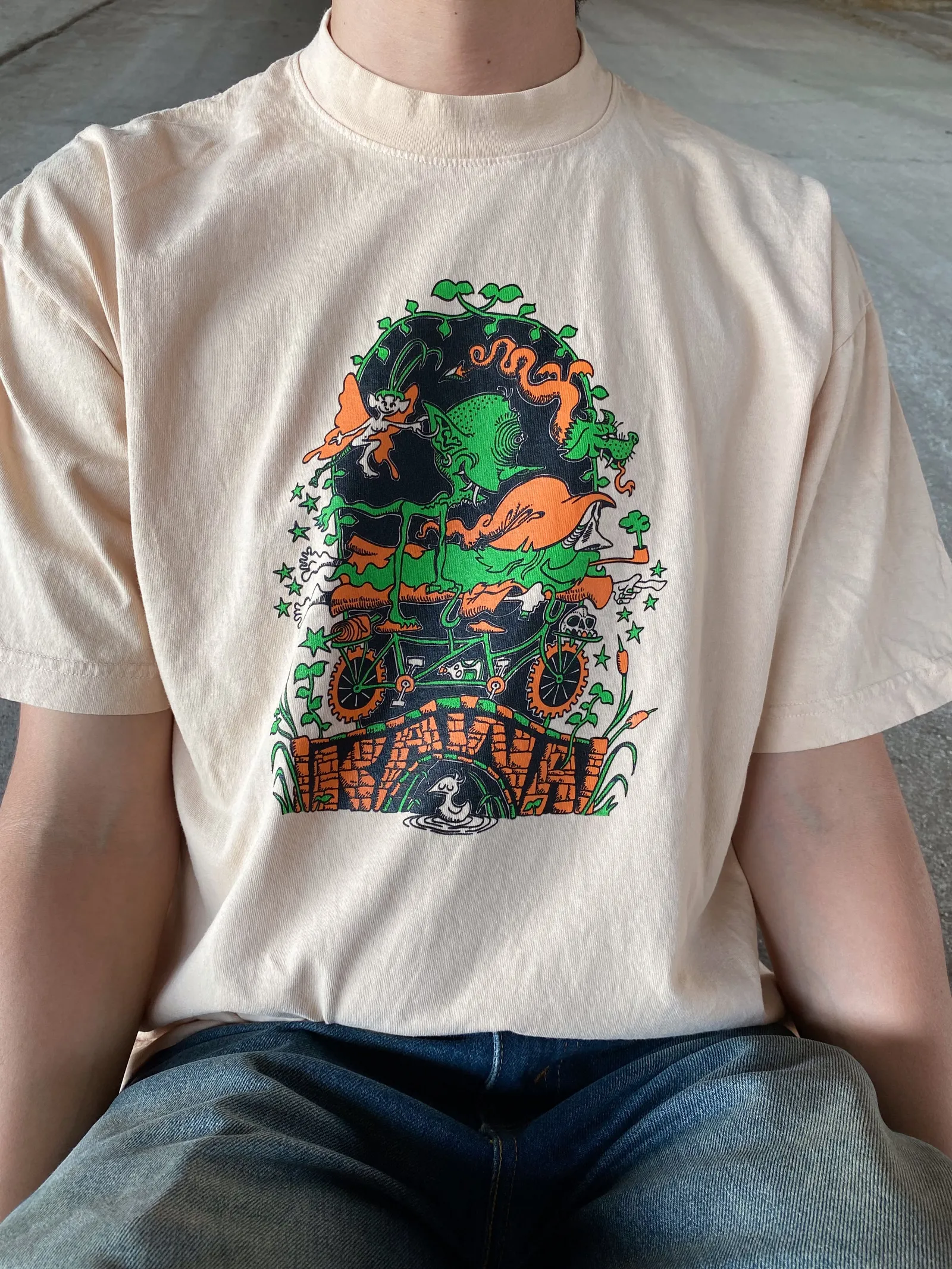
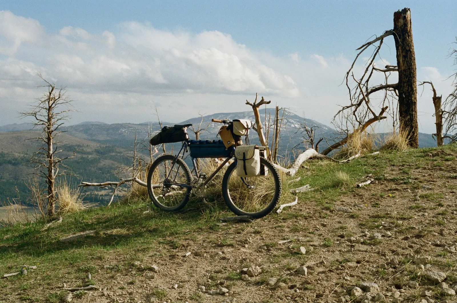
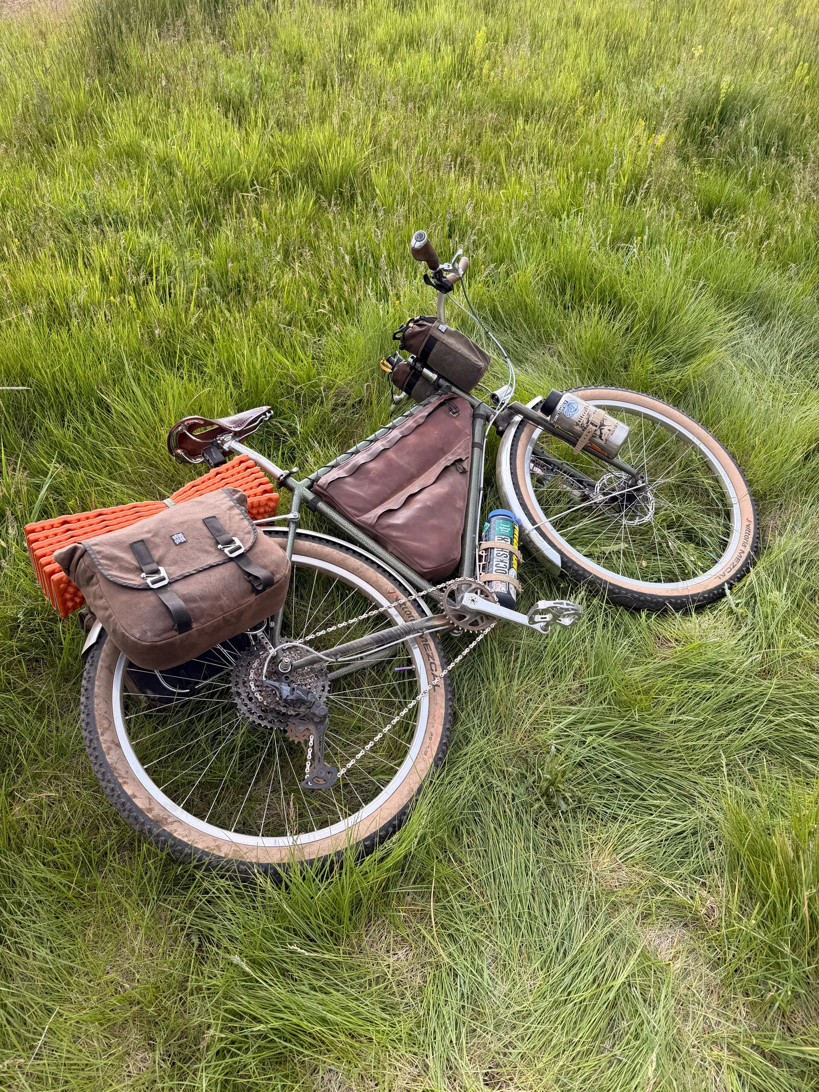
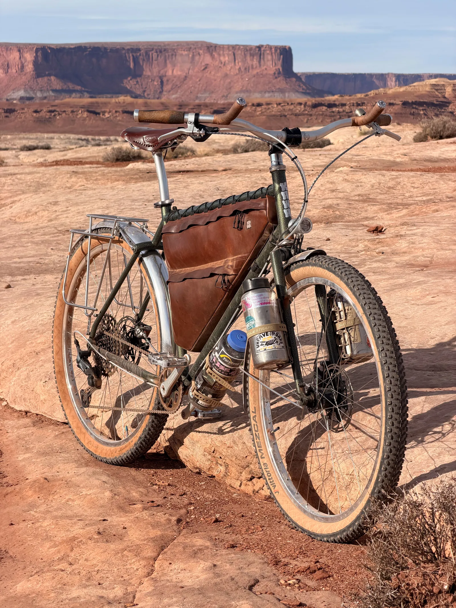
My Brand Identity continues in the materials and design choices I make for my bags. I mostly use natural and recycled materials for my bags, as well as a lot of natural tones, and sleek simple designs. The simple designs are made to not be a distraction, but something that blends in and feels right at home in the natural world. Natural materials create less harm to the environment, can have a longer use life, are more repairable, and gain a beautiful patina as they age. While using these materials does make bags heavier, Life is not a race and it should be enjoyed. My products are there to help people enjoy their time, while being with them for the long haul.
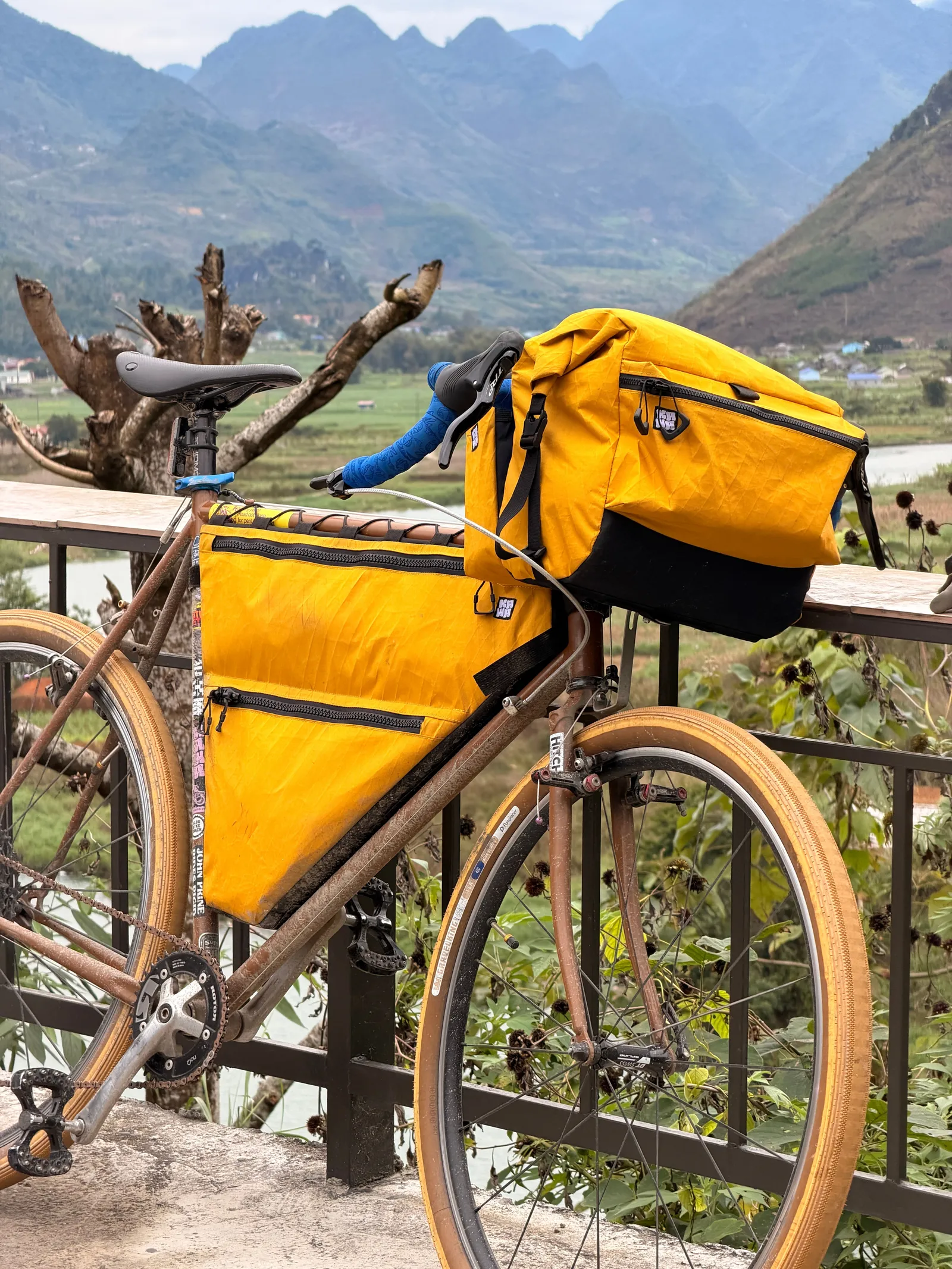
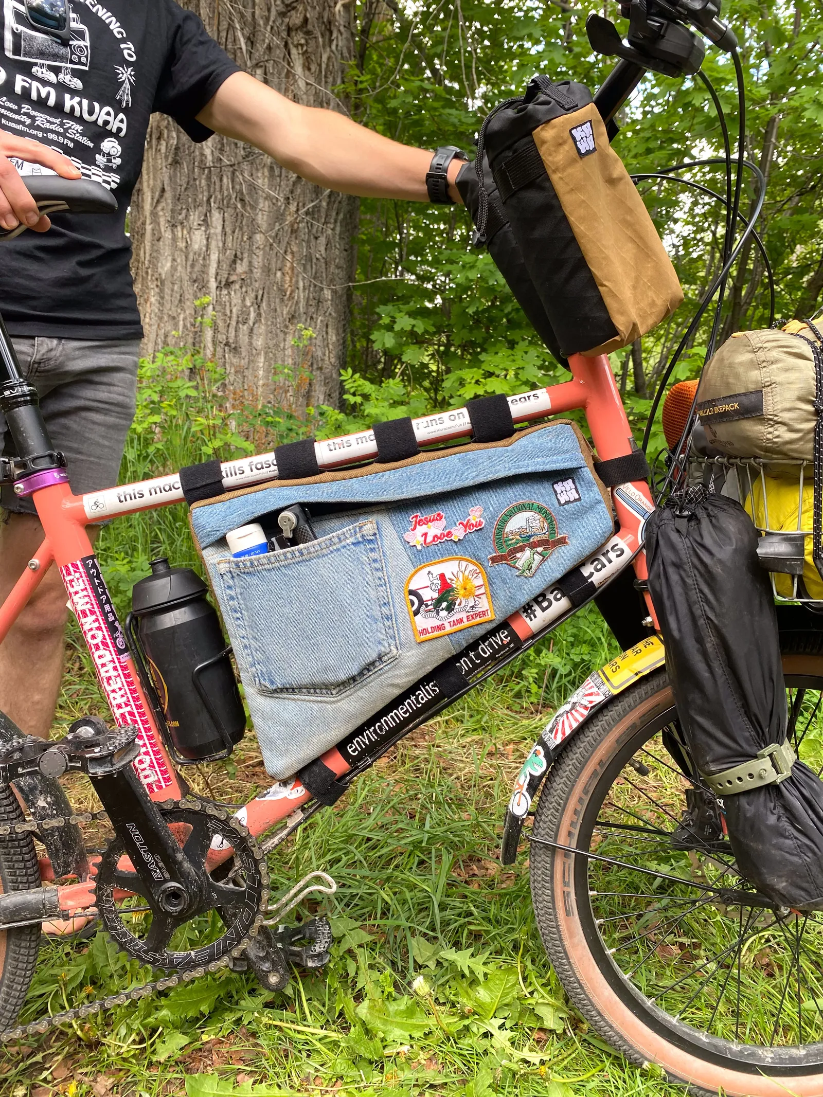
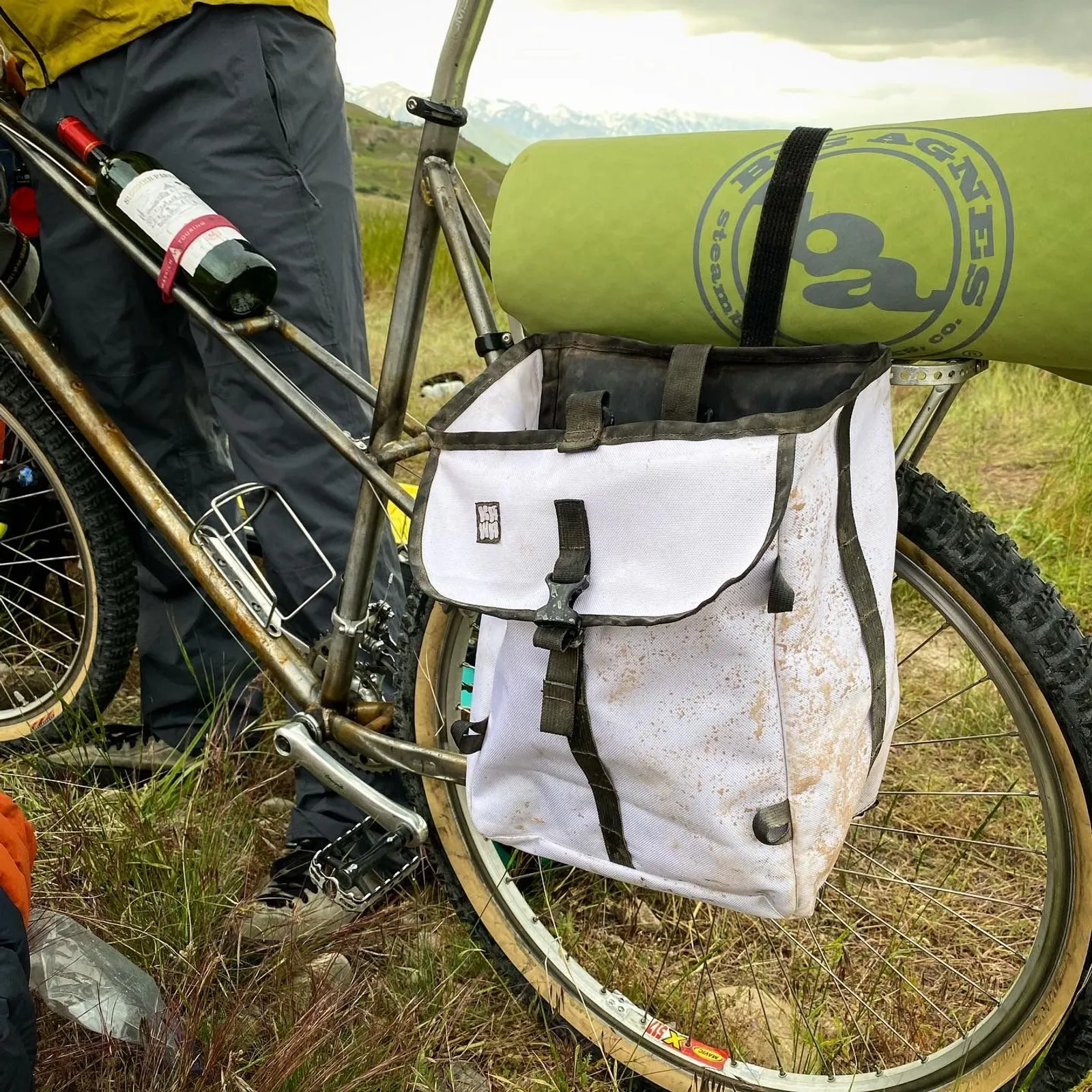
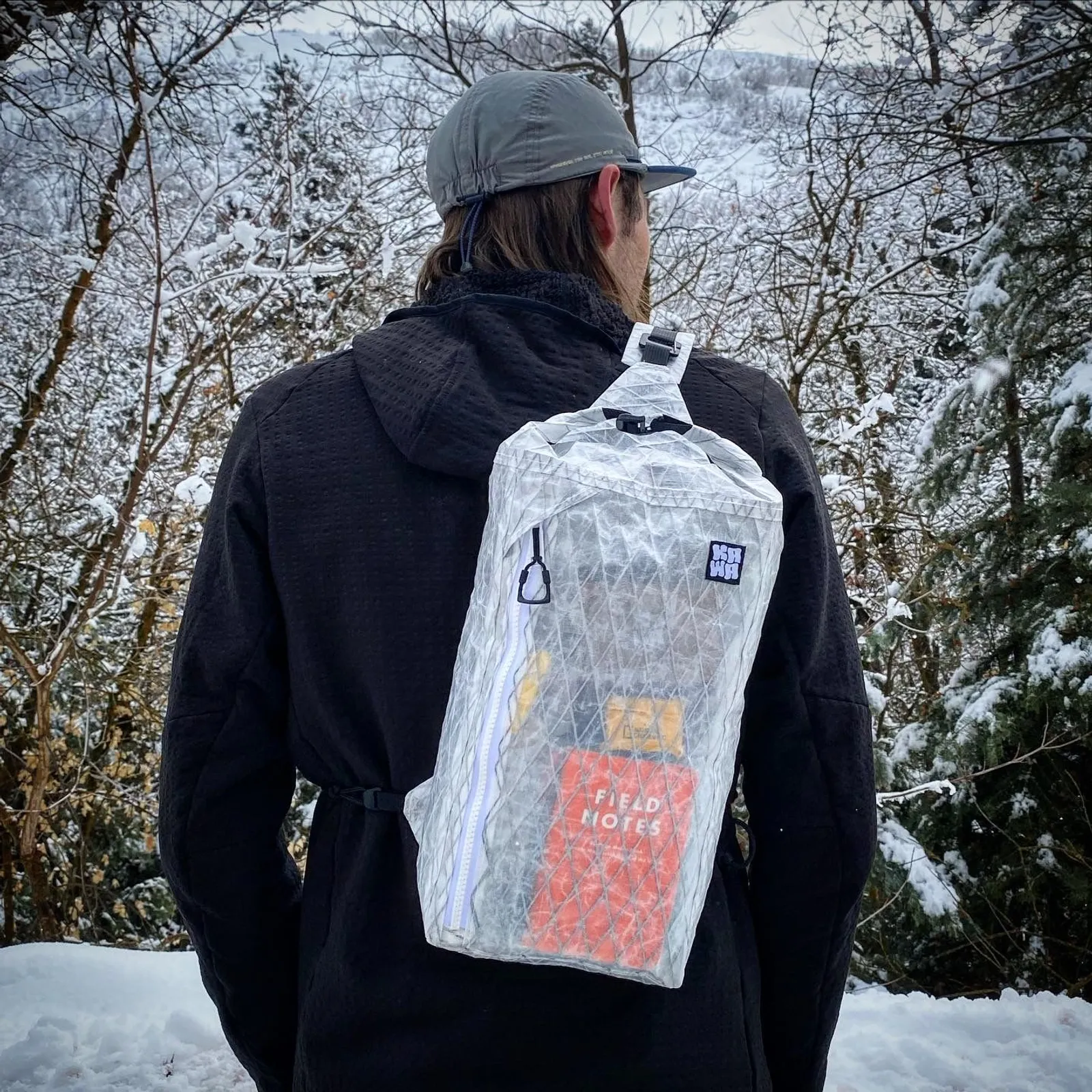
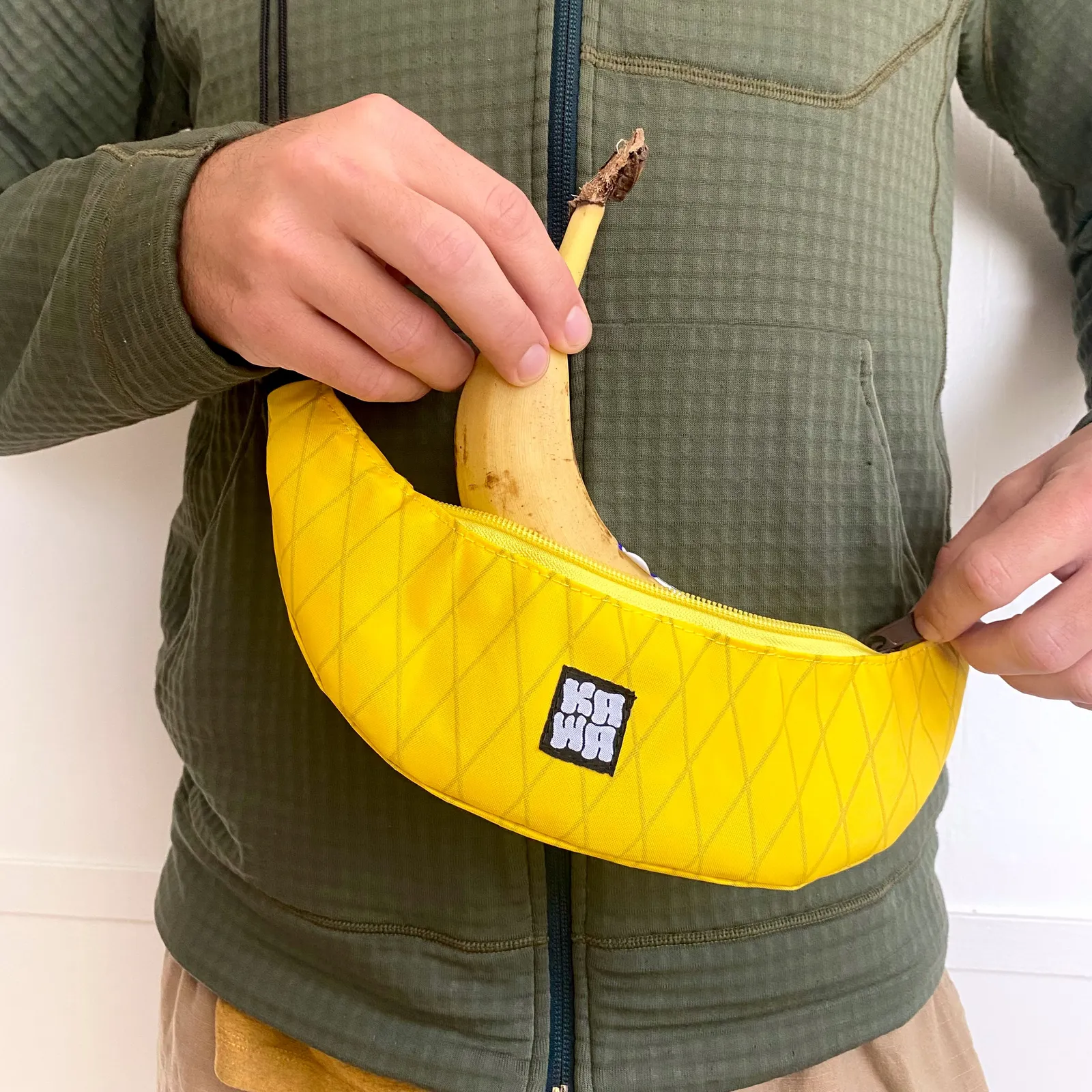
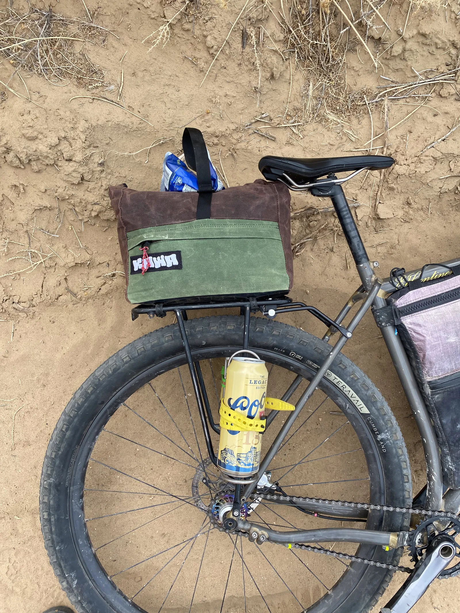
Most of my advertising work with Kawa has been through social media, word of mouth, and media coverage. An example of some of the media coverage I have gotten is my two articles in Bikepacking.com, One written about me and my start with Kawa, and one written by me about my bike and its bags.
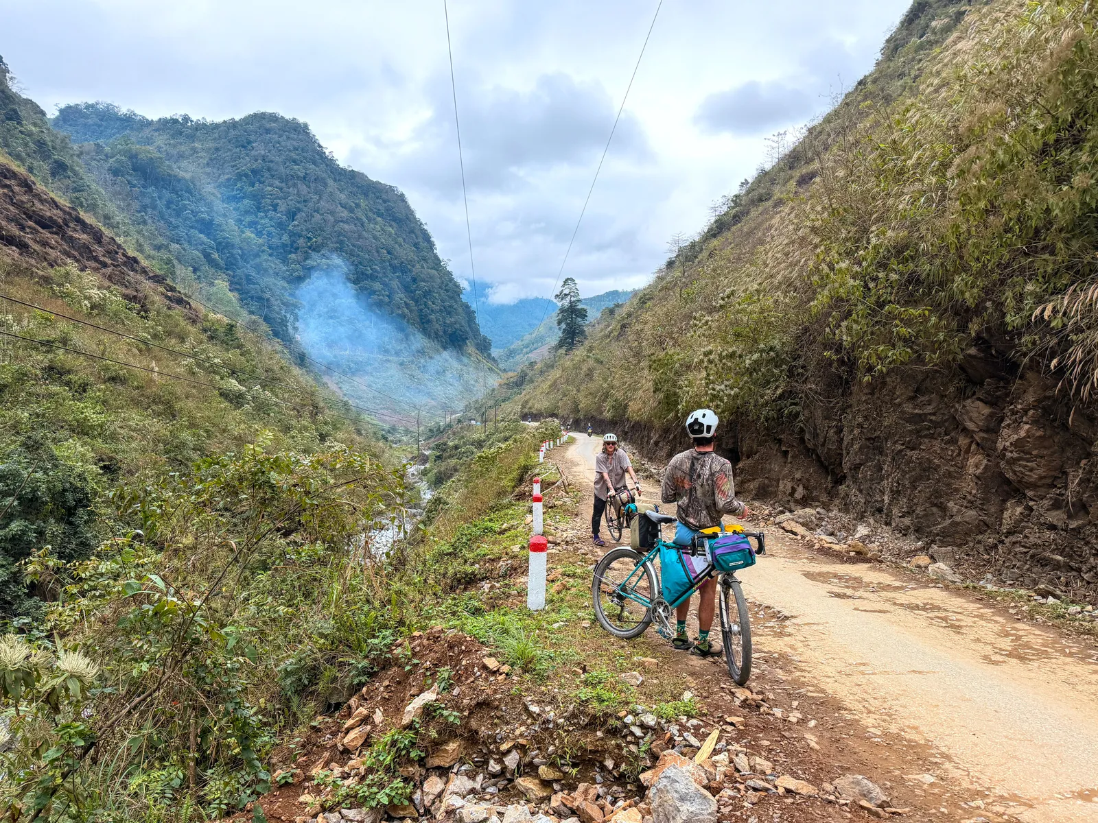
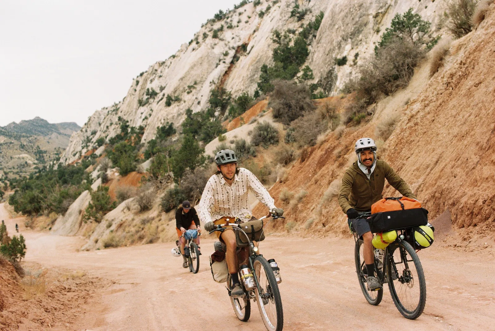
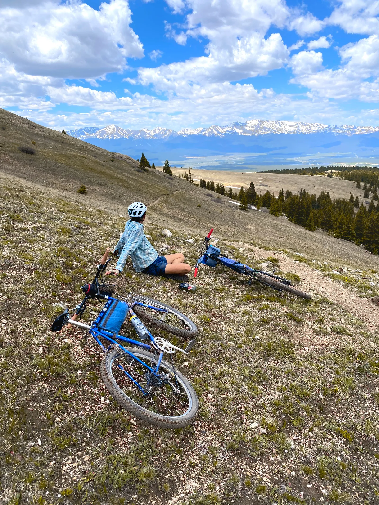
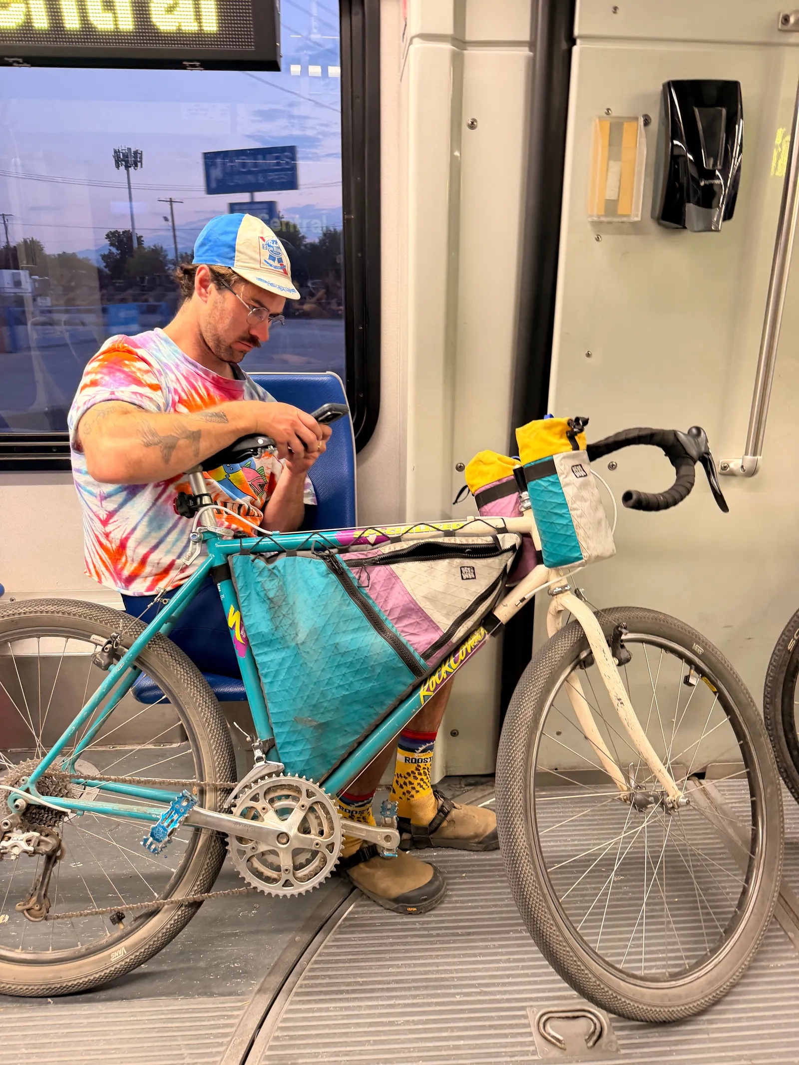
With Kawa, my advertising and media are made to feel personal and handmade, similar to the products that I make. A lot of my branding shows people using my bags and gear not in an intense outdoor sport and race setting, but in everyday casual use. A lot of this includes candid videos of rides around town, small trips on local trails, and people using my bags in their everyday life. Having this more personal view into my own life and how I design and make these bags shows my audience how they are different from something mass manufactured. Each bag is unique and has a character that I want to show off. My social media presence has gained an organic international following because people connect with this, there are often comments on my videos from countries around the world.
The Kawa website was another project I made from scratch for the brand. It connects with the natural aesthetic with its main landing page being a collage that I made from pictures of various rocks and lichen that I have taken on trips. The rest of the site continues this theme with rock textures and a custom cursor designed to both resemble a seedpod and bike cog. I also added features on the website that made it more personal and fun to use, like custom button sounds, cursor animations, custom button icons, a guestbook, and interactive map page. All of these features were made to give the feeling that you were on a trip yourself, looking at maps, reading logbooks, flipping through pictures.